Hi there! Finally I'm writing a blog post again. This time it's about products development. In art class we first had to design a bottle label and then take product photos. If you just want to see the final result, you just have to scroll all the way down.
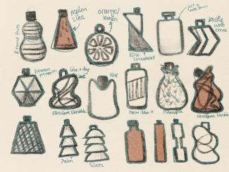
First Ideas
I knew from the beginning that I wanted to do more of a simple, plain, minimal design. Nothing with a lot of structure, different colours and colour gradients. That's why I also wanted as straight a bottle as possible, without a lot of curves. The material I wanted was glass. That's when a memory of the Bundaberg bottle popped into my head. I decided to start with that bottle.
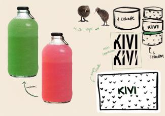
Next, I began sketching various design elements. One was the birds, for example, and the other was the logo. An image slowly began to form in my head.
Further developing
For the whole development process I worked on my Ipad with the app Procreate. But when I had a finished concept sketched, I switched to Adobe Illustror.
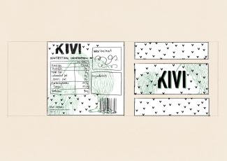
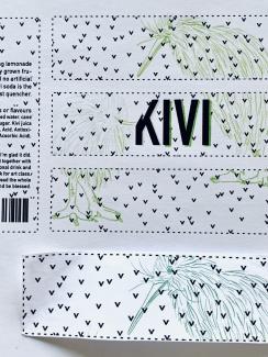
Printing
When it came to printing, I made an embarrassing rookie mistake. I did a test print on some paper at school to make the final colour adjustments. But I had to do the final print at home because I didn't have the paper for the label with me. At home, I only did a black and white proof print to test the size, as this caused some difficulties before. Then I printed the label in colour. But the green was much weaker than the printer at school. The green would have been much too weak. So I traced everything with a fineliner. In the end it worked.
Product photos
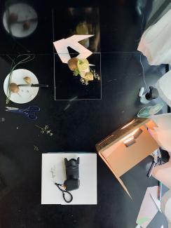
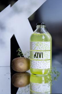
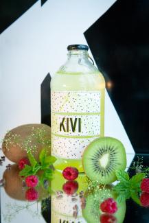
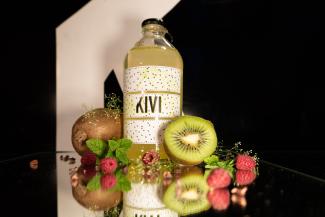
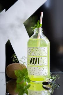
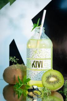
Once my label was finished sticking on the bottle, I started taking product photos. First I photographed in a cardboard box and different papers as background. But the results were too boring and I didn't like them that much.
In a second round I worked with a black background. I took a lot of photos. I realized how many details matter. Where are the reflections, where is the light source reflected, what are the accessories doing around the bottle, from which angle is the bottle photographed and with which focal length. Below I have included a few photos with a comment on what I like and what is not so.
That's it with my documentation.
Be inspired and be blessed!
Viviane